It is difficult for businesses to survive and do well these days without a website. But not everyone out there on the internet with a website is doing brisk business. To succeed in the online circuit, you need to make sure that your website has an attractive layout, it has a user-friendly interface, and most importantly, it should have a responsive web design.
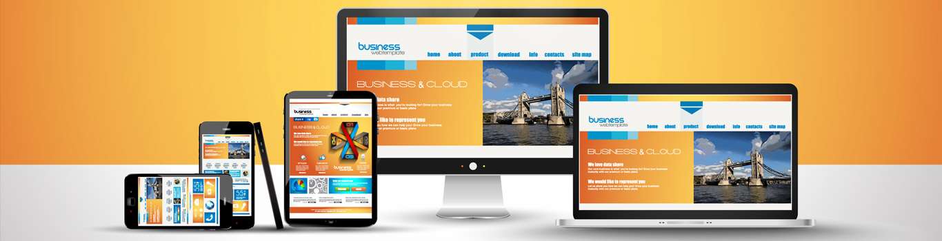
It is true that if you want to succeed in the online landscape, you need to have a responsive web design. Responsive web design is essential for your website not only because it offers a better user experience, but it also improves your search engine rankings.
In 2015, Google altered its search engine algorithms to take into account a website’s mobile presence for ranking purposes. What it means is simply this – you need to develop websites that are user-friendly on mobile devices, especially on smartphones. Your users should be able to read the text on mobile devices without zooming it, the design should have adequate space for tap targets, and users should be able to read the text without horizontal scrolling.
So, why is it essential to make your website responsive?
As the number of mobile users increases worldwide, businesses cannot afford to have a web design that is not responsive. Smartphone users worldwide crossed
2 billion in 2016, and according to estimates, in 2018 they will surpass 2.56 billion. Also, mobile searches have seen a steady rise in comparison to the desktop searches which has consistently seen a dip over the years.
What it means for businesses is that you cannot and should not ignore your mobile users. Hence, if your website is not optimised for mobile devices, it can experience a dip in your search engine rankings. And, it is not a cost-effective solution to have different solutions for different devices, so you need to make sure that your website design is responsive.
What is responsive web design?
RWD or responsive web design allows your website to fit into the size of your user’s device without changing the URL and content source. Responsive web design should offer a seamless experience to your users on all the devices. It means your website should look the same on all the devices, namely a desktop/ laptop, tablet, and mobile phones.
Responsive web design uses HTML and CSS to automatically resize a website to make it appear good on all devices, be it a desktop, laptop, tablet, or smartphone.
Earlier developers had to make more than one website to accommodate different screen sizes. But as mentioned above, it is not a feasible option to have different websites for different devices. Having a responsive web design, therefore, is not a trend anymore, it is a necessity which businesses cannot ignore now.
Why is it important for businesses to opt for responsive web design?
With a responsive web design, you can increase your reach to your prospects who use mobile devices. Also, with responsive web design, you offer a seamless experience to your customers which can increase lead generation, boost your sales, and improve your conversions.
Having a responsive web design ensures that analytics, reporting, and tracking can all happen from one place. You also save on time and money in managing the content of your website.
Last but not least, it helps you stay ahead of your competitors.
Benefits of using a responsive website
With Google dominating the search market, there is no way you can ignore it. And, according to Google, smartphone-optimised sites should have a responsive web design.
Opting for a responsive website offers several benefits, here are some of them:
Responsive web design increases your traffic – Mobile users form a formidable chunk of your prospective customers, and you cannot afford to ignore them. Also, it is not a viable option to maintain two websites – one for your desktop users and the other for mobile users. Hence, the best practice is to opt for a responsive website which works well for all the devices. When you opt for responsive web design, you do not need to worry about losing out on your mobile users. This also keeps you abreast with competition.
Responsive web design is cost-effective and low on maintenance – Maintaining two websites (one for desktop and the other for mobile) is not just more time consuming, but it is also a costly option. But when you opt for responsive web design, it turns out to be a cost-efficient option in the long run. Though responsive web design would cost you more initially, it is easy to maintain, and it is also more cost-effective. Moreover, setting up two websites is a more time-consuming option in comparison to creating one that is responsive in design. With only one site to maintain, you can have more time to focus on other areas which need your attention.
It offers a seamless user experience – If you cannot offer a seamless experience to your customers, it is difficult for you to survive in the business world these days. If your website is not responsive, it can distort the appearance of your site on mobile devices which can put off your customers. Nobody likes to do business on a site where the images do not align properly, texts are jumbled, and you have to search endlessly for one single information. And, when it becomes difficult for your users to navigate the site, they might leave you for good. It is, therefore, important to offer a seamless user experience to your prospects. That is why you should have a responsive web design.
Responsive web design adapts easily to all screen sizes – With a responsive web design in place, you do not have to worry about the competition. You can remain ahead of your competition because you can cater to all your clients. When your website adapts easily to all screen sizes, you will not lose out on customers who use smart devices like smartphones, tablets, smartwatches, other IoT devices, etc. When you have a responsive web design, your website can adjust to every screen with perfection.
Most importantly, it improves your SEO efforts – A website with responsive design is likely to rank higher on the SERP. After the Google algorithm update, if your website is responsive in design, it increases your visibility on the search engine because it is mobile-friendly. If your website offers a seamless mobile experience, it is bound to fare well in search results in comparison to the one that is unresponsive. The more seamless the user experience you offer to your customers, the more are the chances of improving your SEO efforts. And, the more you rank high on the internet, the better are your prospects of generating leads, increasing your conversions, and boosting your sales.
For making responsive website design, you should get in touch with vStacks Infotech now. vStacks Infotech is a digital marketing company, and we have the necessary experience and expertise in designing responsive web designs for businesses in all the verticals.